💡 Overview
Prime Munchies is an upcoming meal prep service founded by Chef David, designed to let people enjoy professional chef-quality meals even on busy days. Beyond standard meal prep delivery, Chef David plans to offer private chef experiences at home, giving customers a personalized, high-quality dining experience. The service will feature a wide variety of menu options, ensuring there’s something delicious for everyone. The business is planned for launch next year, combining convenience with a premium culinary touch.
I’ve worked closely with Chef David from the start on branding, visual design, and website concept. The research and branding are now complete, and the website is currently in testing, focusing on showcasing Chef David’s culinary expertise and menu variety. I also contributed to business strategy, including goal setting, target audience definition, and competitor analysis, ensuring the brand communicates the premium, chef-prepared experience.
Role
UX/UI designer
Duration
3 months
Platform
Desktop
Tools
Figma
📚 Research & Strategy
Goal
After discussing with Chef David and analyzing the business direction, I researched why meal prep services appeal to customers and how to turn that into an effective online experience. From this, the main goals for the website were defined as:
Generate revenue
Enable customers to easily browse, customize, and order meal prep online
Help customers save time and reduce stress with delicious food
Showcase Chef David’s portfolio and expertise
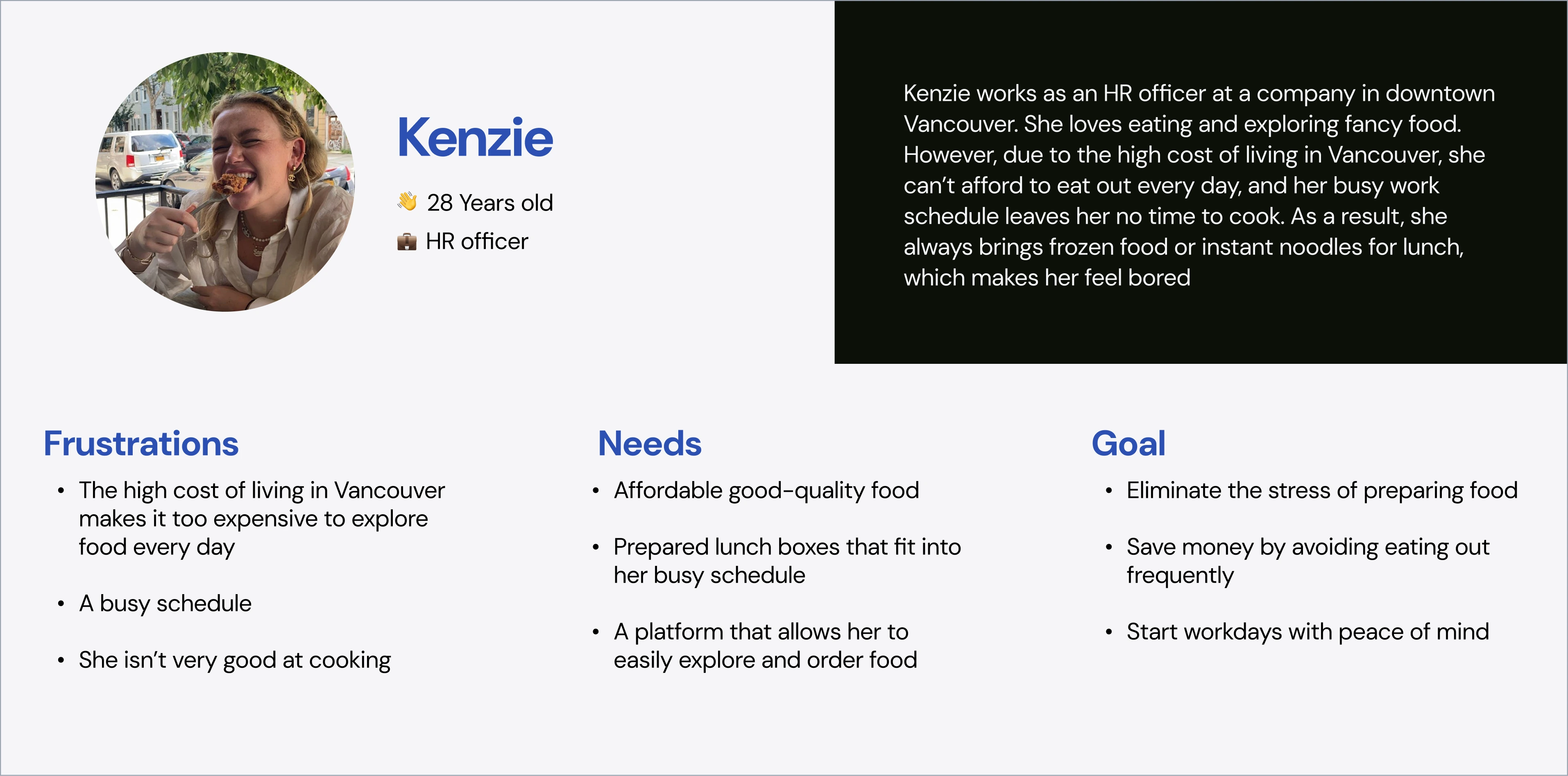
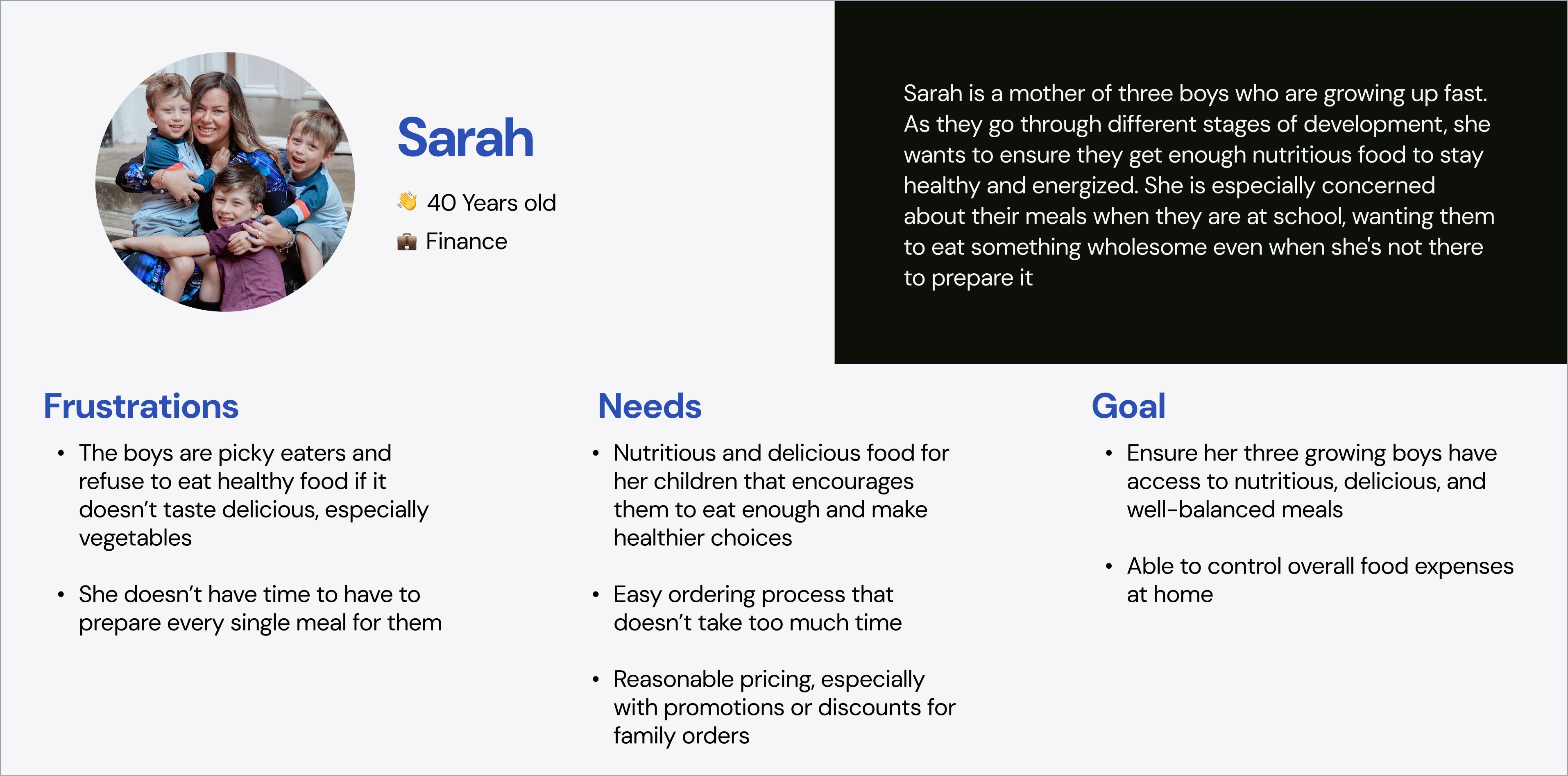
Target audience
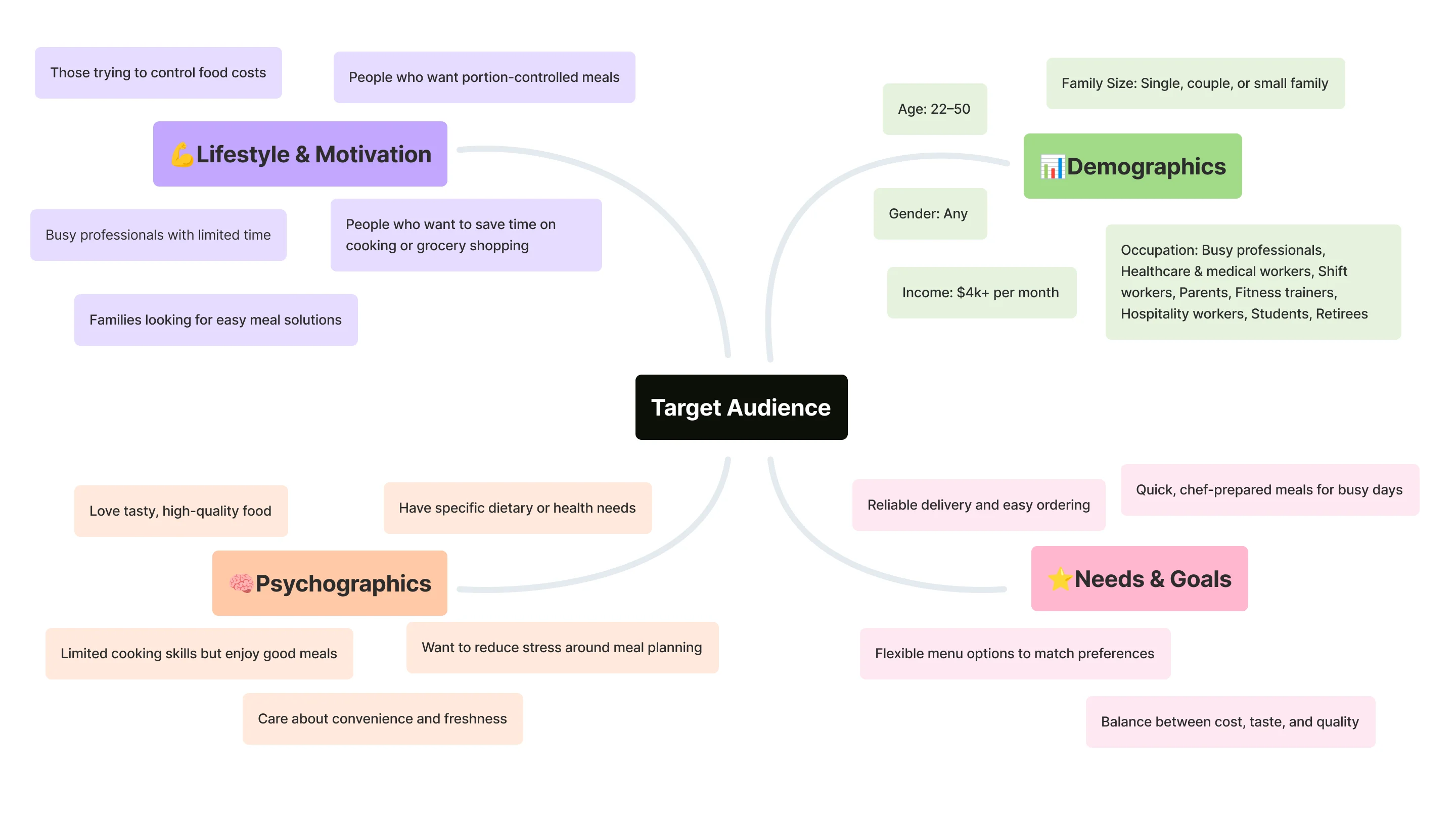
After defining the target audience, I created user personas to better understand their needs and visualize real user scenarios.
Competitor analyst
I researched meal prep service competitors across Vancouver, focusing on their unique value propositions, service differences, and overall user experience. I analyzed where competitors excel and where their drawbacks or usability gaps exist, identifying opportunities for Prime Munchies to stand out. The main focus was on improving the website UX while also considering how each brand structures its services and offerings. From this, I defined ways Prime Munchies can deliver stronger value, helping customers see why they’d choose us over others.
Key Insights ⤵
- Most competitors offer fixed menu which limiting variety for regular users.
- Few competitors allow ingredient-level customization, such as selecting different meats or adjusting ingredients.
- Most competitors focus on dietary-specific options (e.g., plant-based, vegetarian, diet-focused), but offer limited choices for users who simply want tasty, everyday meals.
- Some brands require minimum orders or subscriptions, which can discourage users who want to try meal prep services occasionally.
- Several brands do not provide heating instructions, which can negatively affect the user experience.
- Few competitors plan meals by day, ensuring users get balanced nutrition across all meals.
- Some brands lack promotion of professional chef preparation or food taste, missing an opportunity to build trust and appeal.
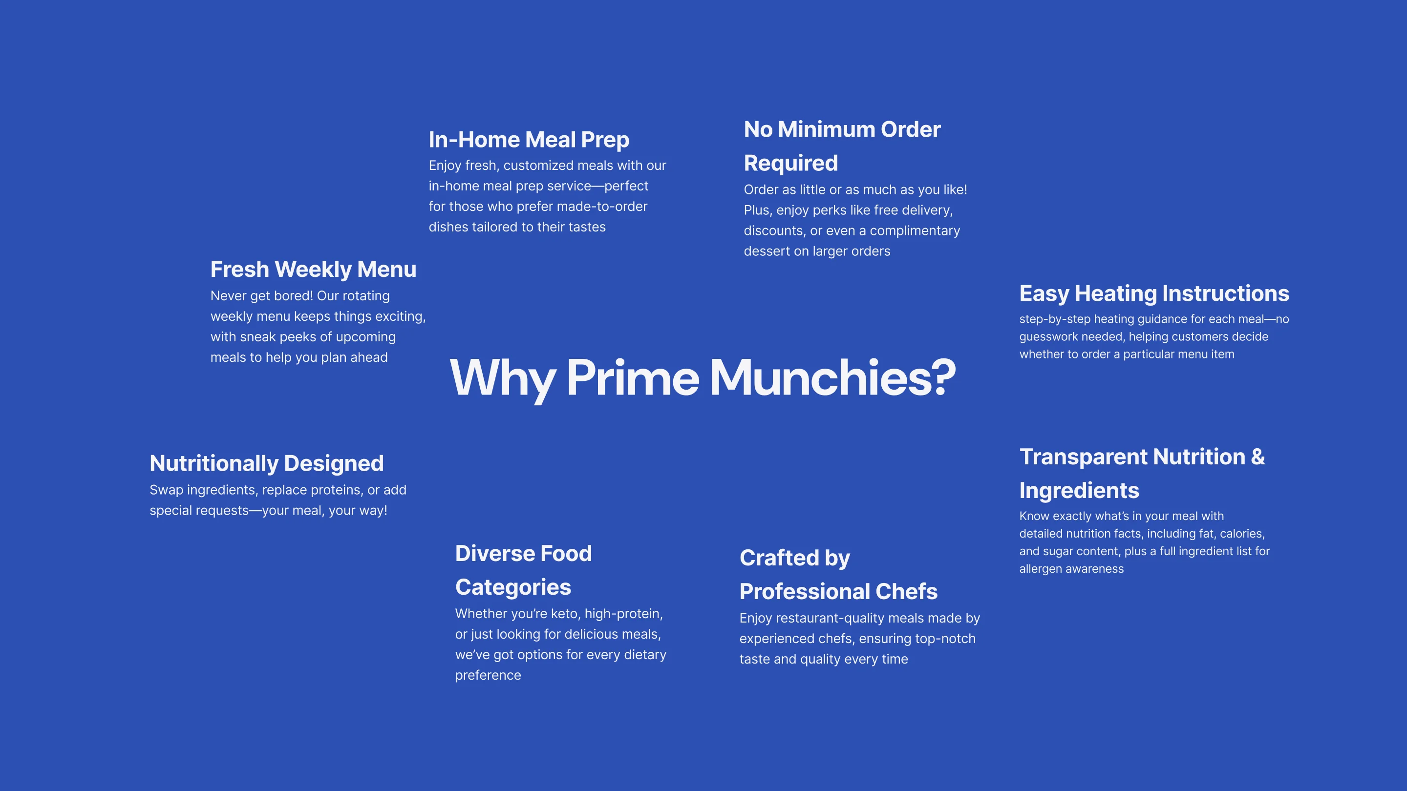
- There is a clear opportunity for a service that combines personalization, clear instructions, flexible plans, and chef-quality meals, differentiating itself from competitors.
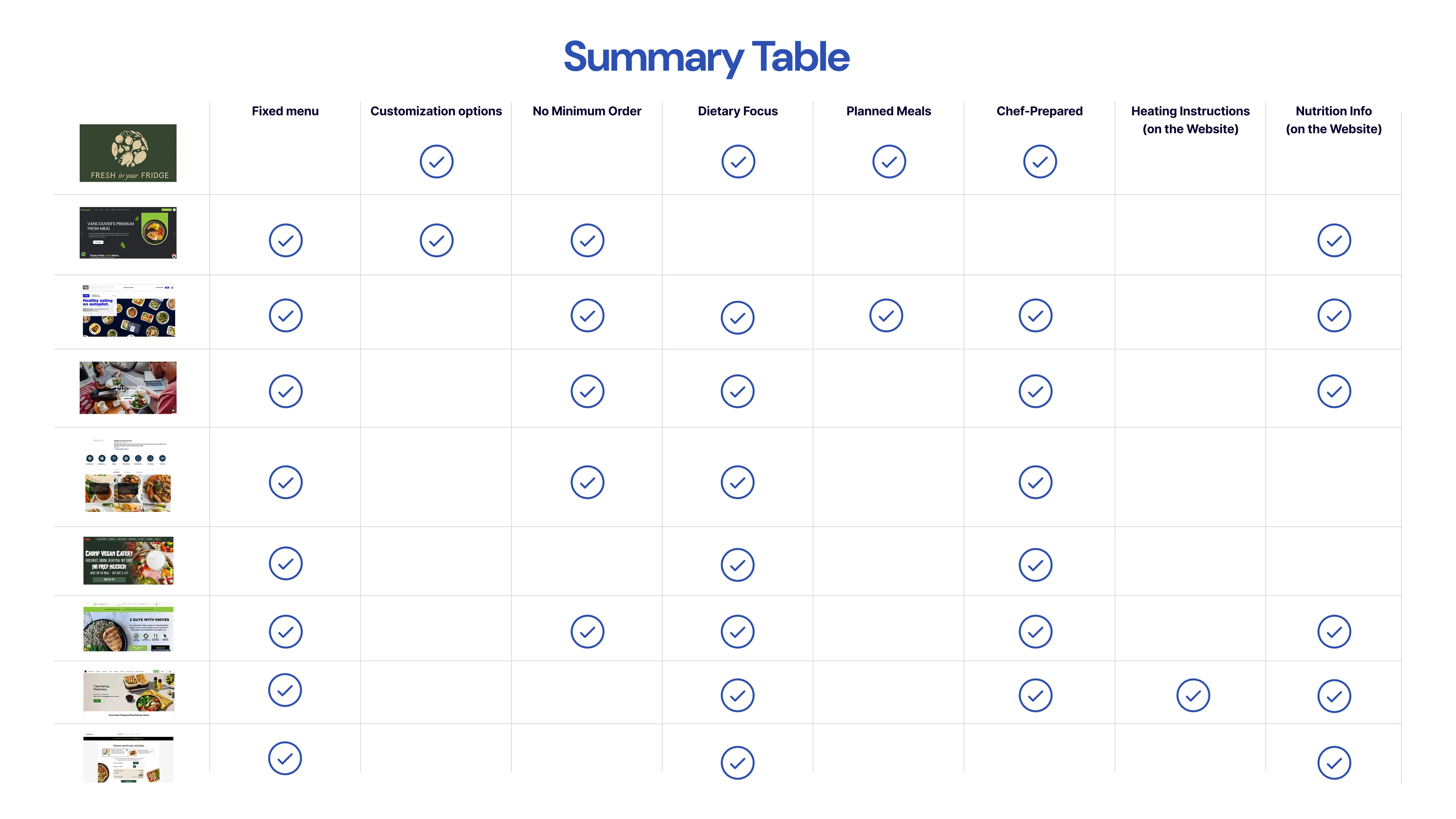
These findings helped me identify opportunities where Prime Munchies could stand out.
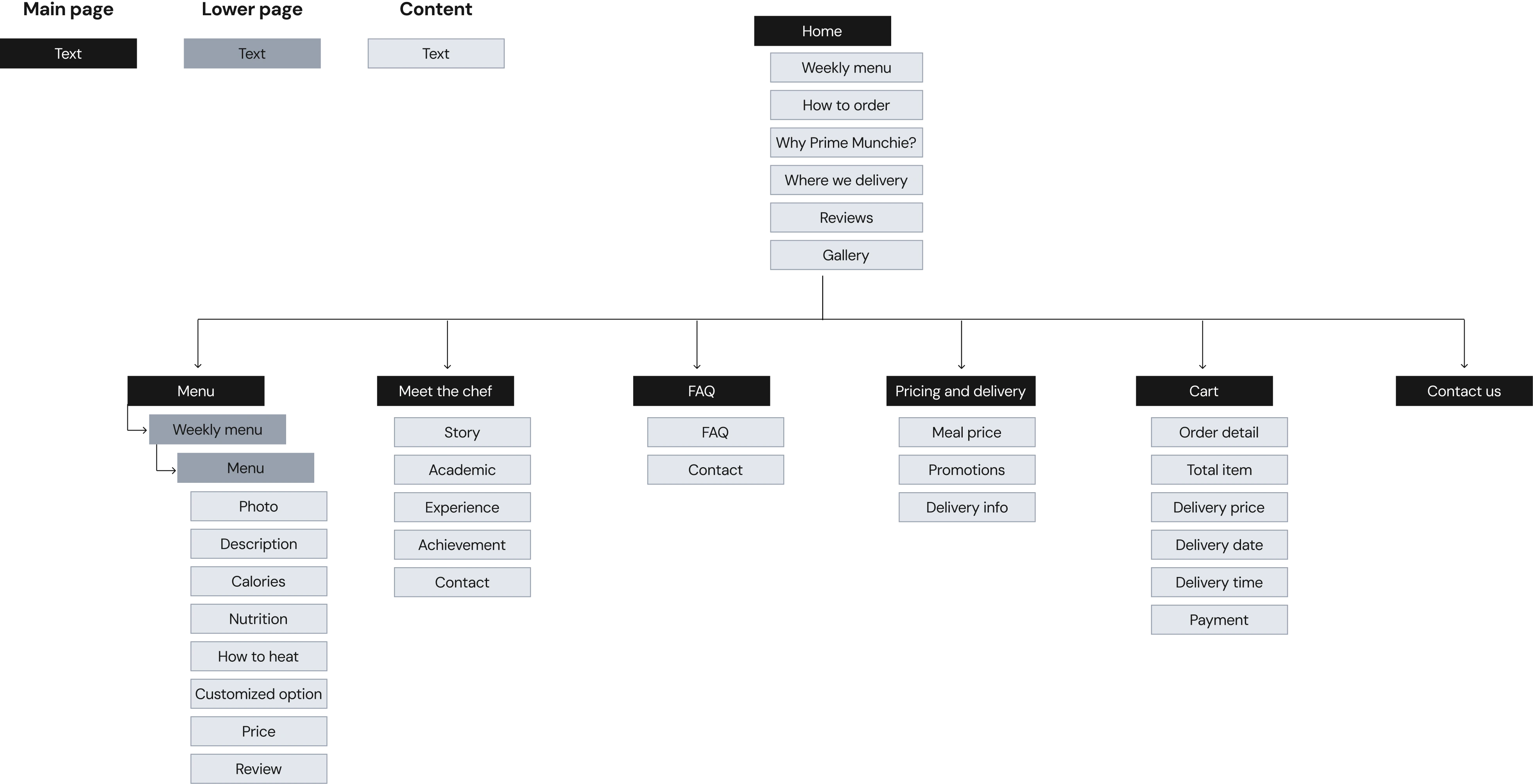
📚 Information Architecture
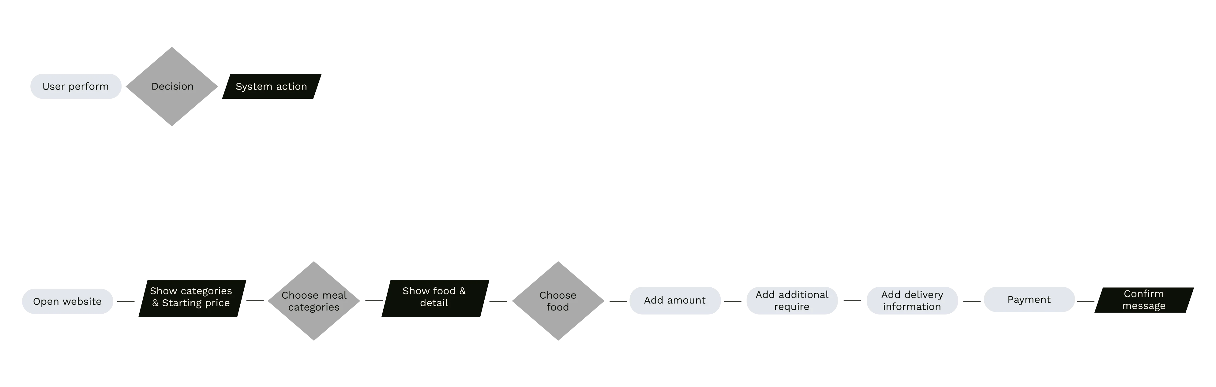
🚕 Meal Ordering flow
🧑💼 Customer Journey
🎨 Branding
Based on my competitive research, many meal prep brands have a dietary focus, such as diet-specific, plant-based, or vegetarian menus. As a result, their websites often appear polite and minimalist in style. In contrast, since Prime Munchies offers a wide variety of meals for all types of eaters, I wanted the brand to stand out with a more casual and joyful approach. The design highlights Chef David’s personality and expertise by featuring his face as the logo, emphasizing that each meal is crafted by a professional chef. Bright, energetic colors were chosen to make the website feel fun, friendly, and approachable for everyone.
🖍️ Sketching

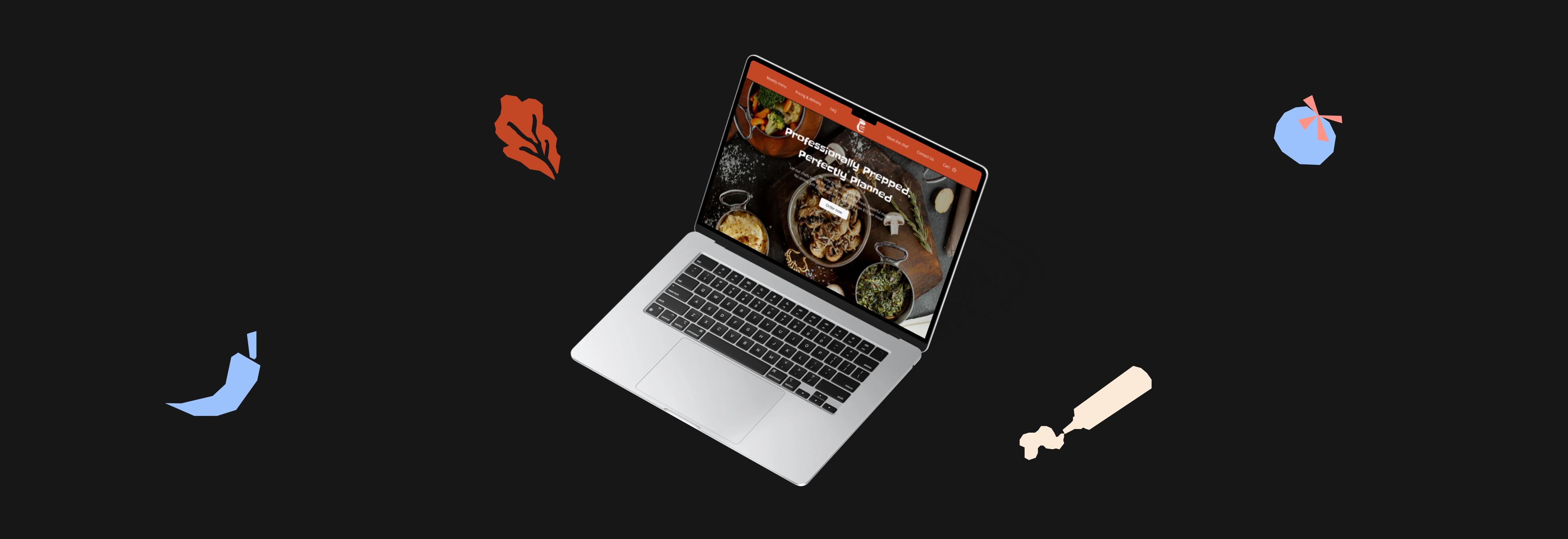
🖼️Mock up
After finalizing the sketches and branding direction with Chef David, I made several adjustments to the mockups to improve accessibility and enhance the user experience.
🏃♂️ Next Steps
We’re currently in the testing phase, gathering user feedback through interviews and accessibility testing to evaluate the website’s usability. Once we collect and analyze the results, we’ll refine the design based on the insights. After finalizing the improvements, I’ll move forward with front-end development to bring the website to life.
The goal is to ensure the final product delivers a fun, seamless, and inclusive experience for all users.